 Elevon in Forbes
Seven Towers Earn, Two Lose, and One Cost Drives Them All
A broadcast infrastructure operator tracked revenue and cost centrally but not per tower. An eleven-tower audit produced a profit and loss view for each one, and found a single cost category carrying the profitability of the whole portfolio.
Client
Our Telco client
Industry
Telco
Solution
Analysis and advisory
Deployment
Proof of Concept
Real data in. A decision document out. One narrative summary and one next step for every tower.

The Question
The operator manages a portfolio of broadcast towers where revenue and cost are tracked centrally. At the level of an individual tower there was no reliable view of profitability. Cost arrived from several systems and categories, allocated electricity, maintenance, rent, spare parts, property tax, and the labels were not consistent between them.
Three decisions were waiting on that view. Which towers earn and which lose money. Where the cost structure is so rigid that it cannot be influenced at all. And where renegotiating a supplier is worth the effort, versus where divestment is the honest answer.
At portfolio scale even a small per-tower optimization compounds. Tower economics was therefore selected as the first use case out of four shortlisted with the client, ahead of ticket reporting, assisted ticket creation for field technicians and land and rental management.
How We Approached It
The scope was deliberately narrow, so the client could verify the method before trusting the conclusion.
Real operational data, not a sample set
Eleven towers, two consecutive years, taken from the operator's own systems. A sample small enough to check line by line, which is exactly what made the conclusions defensible.
Cost categories standardized first
Before anything could be compared, cost categories were mapped into business-readable labels. That step alone surfaced duplicate categories and zero and negative entries that no existing report had flagged.
A decision, not a dashboard
Every tower got a narrative summary, a cost risk classification and one concrete next step. Written to be read at a management meeting, not explored through a filter.
“We knew the portfolio was profitable. We did not know that most of that profit rests on the price of one input we do not control.”
The Method
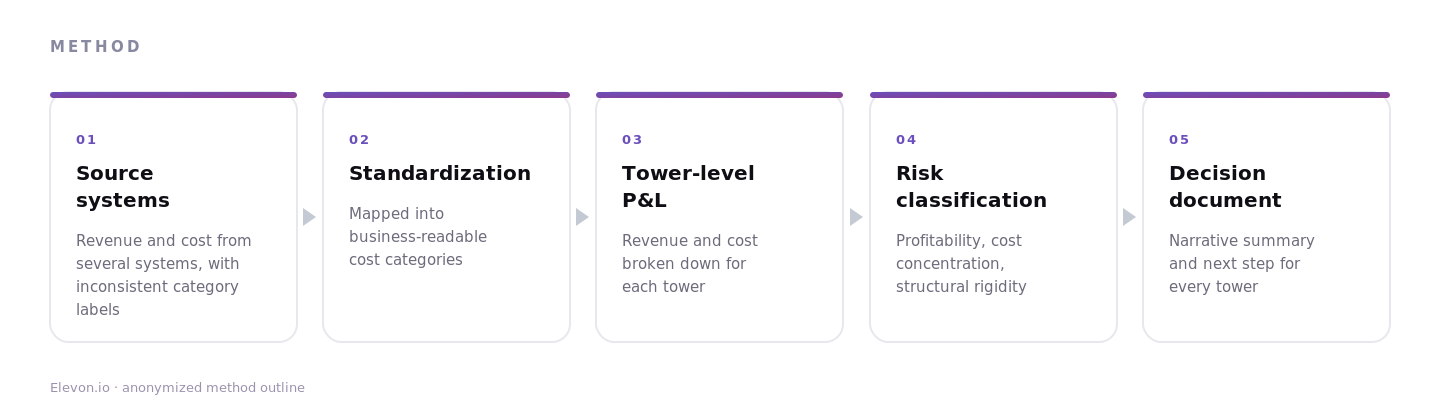
Revenue and cost data for eleven towers was consolidated from several source systems and mapped onto a single set of business-readable cost categories. Each tower was then broken down into a profit and loss view across both years.
Each tower was classified by profitability and by cost concentration, then written up with a recommendation. The report closes with actions grouped by horizon, immediate and medium term, plus a separate list of data fixes that have to happen before any reporting is automated.
What this looks like in practice
One tower in the sample carried two similar cost categories with identical amounts. Not a rounding artefact, a classification problem. Left alone, every future automated report would have repeated it faster and with more confidence.
What We Found
Figures are rounded to a level that preserves the finding rather than the exact value. The client's absolute amounts stay with the client.
A profit and loss view for every tower in the sample, across both years
Allocated electricity identified as the primary cost driver in most towers, frequently above 70% of total cost
Two towers found carrying more than 90% of their cost in a single category while running only marginal margins
Loss-making towers isolated with a clear recommendation: restructure or divest
Duplicate cost categories and zero and negative entries flagged before any reporting automation
“Part of the problem turned out to be the data itself. Until the cost categories are unified, an automated report would just repeat the same inaccuracies faster.”
Why It Worked
The proof of concept did not go wide. It took a narrow sample, real data and one question: where in the portfolio does profit come from, and where is it lost. Everything else was left out on purpose.
Because the sample was small enough to verify by hand, the operator could check the method before trusting the result. That turned a portfolio-wide rollout into an easy decision rather than an act of faith.
The analysis also reordered the work. Cleaning up cost classification moved ahead of building any dashboard, because a report standing on inconsistent categories looks authoritative and is wrong.
Want a similar transformation in your organization?
Let's talk about how Elevon can help your team too.
Book consultation